Red Sun Farms launches new branding
Added on 14 February 2021
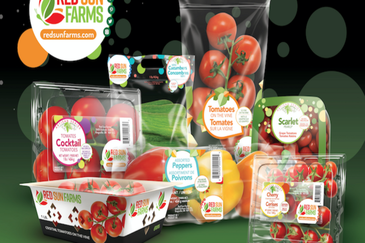
The new logo incorporates the iconic butterfly while maintaining bright, bold colours that honour the history of the brand, ensuring continuity and consistency. Its modern refresh reflects growth and innovation that re-enforces a positive and progressive brand identity.
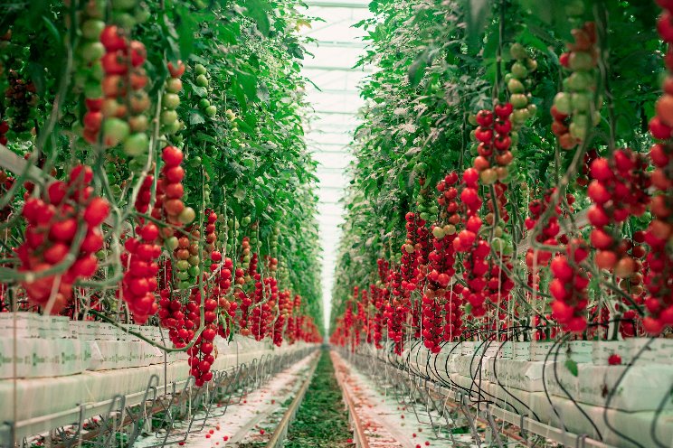
This striking move comes shortly after the company's graphic refresh launch, which centers its design around visibility and transparency to Red Sun Farms high-tech tomatoes, peppers, and cucumbers. The organization's focus on these design enhancements are all about the clarity and authenticity of its produce while maintaining the highest in quality and flavour year-round.
The refresh resulted from market research, retailer feedback and consumer enquiries.
"As the brand continues to grow at both retail and trade events, it was clear that we also needed to evolve our logo to better represent who we are today, while encompassing the possibilities of where we will grow our business tomorrow," states Carlos Visconti, CEO of Red Sun Farms Canada and the U.S. "We continue to invest in our future and our brand to better support our customers."
Source: Red Sun Farms February 2, 2021 news release via The Grower
Source: The Grower
More news
